




Handmade Look Subway Tiles: A Melbourne Buying Guide
by Shivam Tayal 13 Nov 2026 0 Comments
The popular advice to embrace imperfection leaves out the expensive part: someone still has to set out, fix and grout those imperfect-looking tiles. Handmade look subway tiles work best when you choose the room, joint width and installation approach together, not when you pick a pretty glaze and leave the details to your tiler.
For a Melbourne renovation, the useful question isn't just whether the tile suits your cabinetry. It's whether its edge variation, surface relief and intended use suit the wall you're building, the lighting you'll live with and the cleaning you're prepared to do.
What the Handmade Look Is and Where It Comes From
A handmade-look subway tile is a glazed rectangle designed to show deliberate edge irregularity, a slightly wavy face and tonal variation, so the finished wall looks crafted rather than factory-flat. The description refers to appearance, not necessarily to individual hand production.
Say you're choosing a cream tile for a kitchen splashback. A flat sample might match the benchtop perfectly, while a wave-faced sample looks warmer beside it, even when their base colours are similar. That difference comes from how the glaze, edges and surface catch the room's light.
Handmade look vs rectified vs standard subway tiles
These categories aren't completely separate. Rectified describes edge processing, while handmade look describes appearance, so check the actual product rather than treating a showroom label as a complete specification.
| Feature | Handmade look | Rectified | Standard subway |
|---|---|---|---|
| Edges | Slightly rounded or uneven | Square, precisely cut | Mostly square with minor rounding |
| Size consistency | Visible variation between tiles | Uniform, tight tolerance | Small variation |
| Surface | Gently wavy, light reflects unevenly | Usually flat and uniform | Flat to lightly profiled, often glossy |
| Typical grout joint | Wider joint to accommodate the actual variation | Narrow joint permitted by the product specification | Regular spacing matched to the tile's edge |
| Best fit | Splashbacks, feature walls, bathroom walls | Large-format and precise layouts | General walls and budget projects |
| Floor use | Only with confirmed slip rating and floor suitability | Only with confirmed slip rating and floor suitability | Only with confirmed slip rating and floor suitability |
The distinction becomes clearer when you handle several samples together. A single tile shows the glaze; a group shows whether the variation feels gentle, busy or excessive for your room.
What creates the crafted appearance
Uneven edges interrupt an otherwise straight joint and catch highlights around the perimeter. Wavy faces reflect light at different angles, particularly beneath kitchen strip lighting. Tonal variation introduces lighter and darker tiles across the wall, rather than a single repeated colour.
Think of a hand-thrown mug beside a moulded mug. Both can share the same broad shape, but light doesn't sit on their surfaces in the same way. Handmade-look tiles aim for that visual softness while retaining a repeatable rectangular format.
That format has a practical history: early New York underground stations adopted glazed rectangles in the early 1900s, with the familiar approximately 75 × 150 mm, 1:2 proportion valued for durability, reflectiveness and easy cleaning, as described by Domain's history of subway tiles.
The rectangle also gives you options without changing material. Offset brick bond feels familiar, stacked courses make the joints more prominent, and herringbone turns the same tile into a directional pattern. The surface and arrangement make separate contributions, so you don't need an elaborate pattern to make an irregular glaze interesting.
Why it belongs in ordinary renovations
This isn't a finish reserved for an architectural new build. Housing Industry Association estimates cited by realestate.com.au indicated potential nationwide demand during 2024–2025 for approximately 244,000 bathroom renovations and 163,000 kitchen renovations. Those are precisely the kinds of spaces where a small-format wall tile can change the room without changing its footprint.
For an existing Melbourne home, the appeal is straightforward: you can introduce texture beside plain cabinetry, soften a sharply detailed vanity or give a modest splashback some depth.
Keep three decisions together: the variation is part of the product, wall use is the starting point, and the grout joint determines how strongly you see each individual tile.
Deliberate variation still has limits. Chips, glaze faults and tiles outside the manufacturer's acceptable variation shouldn't be dismissed as character. Agree on what belongs in the finished wall before fixing starts.
Ceramic, Porcelain and Finishes Compared
The tile body and the visible finish answer different questions. The body helps determine where the product can be used; the glaze determines much of what you'll notice when you look at it and clean it.
Ceramic generally has a more porous body and is commonly specified for walls. Porcelain is denser with lower water absorption, making it a usual starting point when a specification also involves floors. Our guide to porcelain tiles explains that material choice in more detail, but neither body type removes the need to check the product's intended application.
For wall selection, assess moisture suitability, glaze performance and cleanability rather than assuming that a floor classification is necessary. The distinction between wall products and walked-on surfaces, including slip classification under AS 4586, is important when comparing the wall-tile range at The Blue Space: a suitable shower-wall tile isn't automatically suitable for the shower base.
Finishes for handmade look subway tiles
| Finish | Light and look | Cleaning | Best location | Watch for |
|---|---|---|---|---|
| Gloss | Reflects light strongly and shows the wave clearly | Wipes clean but shows water marks and smears | Splashbacks and suitable shower walls | Glare under task lighting; abrasive cleaning can dull the glaze |
| Matt | Softens the wave and reduces reflection | Clean with a suitable pH-neutral cleaner | Kitchen and bathroom walls, feature walls | Check the sample under your own lighting |
| Textured | Strong shadow and relief; pronounced handmade character | Grooves collect grime and need a soft brush | Accent walls and areas away from heavy splashing | Can retain water and soap; avoid treating texture as evidence of floor grip |
Gloss is the most revealing finish. It can make a pale splashback lively without adding another colour, but a light fitting positioned close to the wall may produce distracting highlights. Look along the sample board from the doorway as well as directly in front of it.
Matt is quieter, not maintenance-free. It reduces reflections, which can make a full-height wall easier to live with, but a pale matt glaze can still show cooking residue or soap. Don't choose it solely because someone calls it forgiving.
Test the finish you'll actually clean
Textured products need a more deliberate location choice. A shallow wave is different from deep grooves or pronounced ridges, especially behind a tap or beside a soap shelf. Run your fingers across the sample and consider whether a cloth can reach the low points.
Use warm water and a pH-neutral cleaner, then rinse and dry as appropriate for the product. Avoid abrasive pads on gloss, and use a soft brush rather than aggressive scrubbing on relief surfaces.
Test the actual glaze before ordering. A finish can change the appearance of a room, but it can't turn a wall-only product into a floor tile or compensate for unsuitable waterproofing.
Sizes, Shapes and Layouts That Change the Room
Choose the module before the pattern. The tile's proportions establish the basic rhythm, while the laying direction determines whether you notice height, length or the joint network.
Compare the formats as a field of tiles, not as isolated samples.
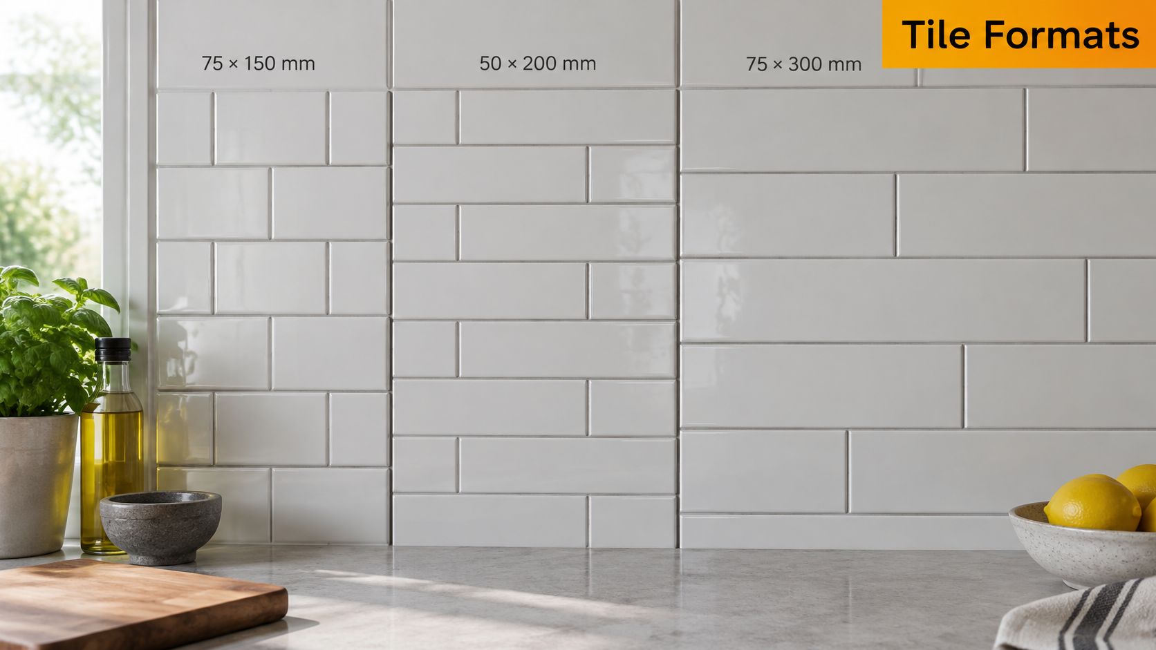
Common subway sizes and what they do
The following nominal formats provide useful options for a sample layout; confirm the actual dimensions before setting out.
| Size (mm) | Look | Best use | Layout note |
|---|---|---|---|
| 75 × 150 | Classic proportion, closely repeated pattern | Small splashbacks and niches | Traditional subway appearance |
| 50 × 200 | Long and narrow, linear | Shower walls and vertical emphasis | Suits stacked courses |
| 75 × 300 | Elongated format, calmer horizontal rhythm | Feature walls and full-height bathroom walls | Fewer end joints across a run; inspect face variation |
A compact rectangle can feel well proportioned around a small basin, but the same format across a large wall creates a stronger grid of grout. An elongated tile reduces the frequency of end joints along a course, though it won't disguise a poorly prepared wall.
Offset brick bond is a forgiving visual partner for irregular edges because the stagger already breaks the grid. Stacked courses are more exacting: the eye follows uninterrupted joint lines, making cumulative drift easier to spot.
Let the pattern earn its complexity
Herringbone gives a plain room movement, but it also creates more perimeter cuts and more junctions to resolve. Ask your tiler to set out the centre line, internal corners and termination points before approving it. Use our subway tile pattern guide to compare arrangements before you commit to an installation drawing.
This video provides another way to assess the pattern before choosing your layout.
Kit-kat, hexagon and feather shapes offer alternatives when the rectangle doesn't provide the effect you want. They aren't all subway modules, and they introduce different edge and grout patterns. Don't combine a complex shape with pronounced irregularity unless you want the wall to be the room's focal point.
For a kitchen with pale cabinetry, The Cabinet Coach's white cabinet backsplash inspiration is useful for comparing how much pattern the surrounding joinery can support.
A narrow bathroom may benefit from a long tile laid vertically; a long splashback often feels more settled with a horizontal running bond. Test the direction against the room's actual corners, windows and cabinetry.
Rooms Where the Look Works and Where It Does Not
Treat handmade-look tiles as wall products first. Their appearance says nothing reliable about wet-floor grip, barefoot comfort or how neatly the finished surface will drain.
The selection principles in Marmore's bathroom tile guide support checking a product's AS 4586 slip classification for floor applications rather than assuming a handmade texture provides suitable wet grip. A rough-looking surface can still be the wrong product for a shower floor.
Room-by-room suitability for handmade look tiles
| Location | Wall use | Floor use | Check before ordering |
|---|---|---|---|
| Splashback | Suitable when specified for the location | Not applicable | Heat exposure, grease removal and reflections under kitchen lighting |
| Shower wall | Suitable with a compatible wet-area system and compliant waterproofing | Not applicable | Avoid pronounced profiles where soap collects |
| Vanity or bathroom wall | Suitable | Not applicable | Compare matt and gloss for water spotting and wipe-down |
| Laundry or living-area wall | Suitable | Not applicable | Visible edge finishing, lippage and grout alignment |
| Shower or bathroom floor | Not the default application | Only with confirmed slip classification, floor suitability and falls to drainage | Barefoot comfort, drainage and uneven corners |
A splashback is often the strongest application because you can appreciate the surface at eye level and reach it for cleaning. Behind a cooktop, check appliance clearances and the tile system's suitability for the expected heat exposure. A decorative wall tile shouldn't be treated as a substitute for following the appliance installation requirements.
Shower walls need a more selective approach. A gently rippled glaze may be manageable, whereas a recessed profile beside the shower outlet can create unnecessary cleaning work. The tile also doesn't provide the waterproofing system, regardless of how glossy or water-resistant its face appears.
Where authenticity becomes inconvenient
The most authentic-looking irregular tile is often the least forgiving choice for a rushed renovation. A tiler may need to sort thicknesses, adjust placement and reject awkward combinations before fixing. Tight geometric layouts leave less visual room for those adjustments.
Lippage is the step between adjacent tile faces. Some face variation belongs to the product, but a proud corner that catches a cloth or feels sharp deserves attention. Review a representative dry layout rather than approving the finish from a single attractive sample.
Before assigning the tile to a room, confirm:
- Floor documentation: Obtain the classification and intended-use information for any walked-on application.
- Barefoot suitability: Check the actual edge and surface, not just the product photograph.
- Drainage: Have the tiler assess the proposed layout and falls, including any places the profile could retain water.
- Pattern practicality: Resolve cuts and corners before ordering an elaborate arrangement.
If the product documentation doesn't support the proposed floor use, choose a dedicated floor tile and retain the handmade look on the walls.
Joints, Grout and Installation for Irregular Tiles
The joint is part of the design, not leftover space. Handmade-look tiles generally need more room around their edges than precisely cut products, allowing the tiler to manage dimensional differences without forcing adjacent tiles together.
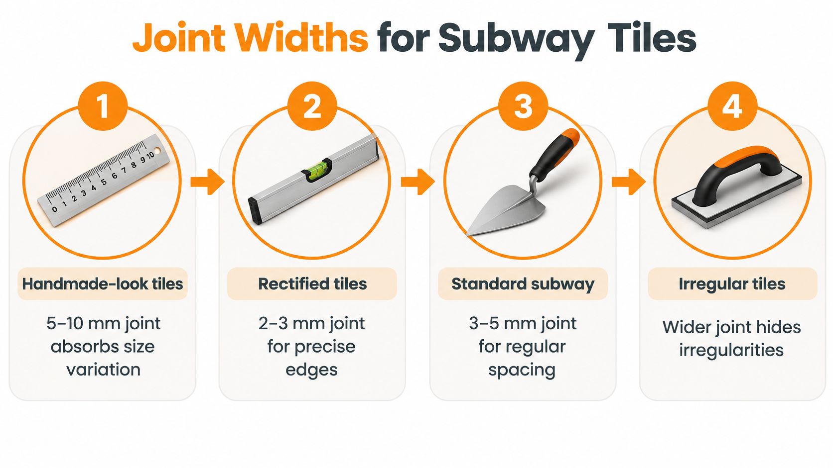
As an installation starting point, handmade or textured products commonly use 5–10 mm joints, compared with approximately 2–3 mm for rectified wall tiles; the Victorian Guide to Standards and Tolerances also identifies grout alignment beyond ±4 mm over 2 m from the specified alignment as unacceptable. Confirm the joint against the actual product and installation specification rather than adopting a generic minimum.
The joint-width comparison below is a planning aid, not permission to ignore a manufacturer's requirements.
Set out the variation before fixing
- Dry-lay several rows. Take tiles from across the supplied boxes and arrange them on a clean, flat surface. Look for repeated dark patches, unusually thick edges and combinations that create awkward corners. The common mistake is approving a single tile, then discovering the overall variation only after the adhesive has set.
- Establish a control line. Use a laser or spirit level to set a reliable datum, then plan the starting course around the benchtop, floor or other adjoining surface. Don't assume that surface is level. A control line set without considering the final cuts can leave a narrow sliver beneath a cabinet or at the ceiling.
- Choose spacers for the actual tile. Check several tiles edge to edge before deciding on spacing. Cushioned edges can make the visible opening wider than the distance between the tile bodies. A spacer that fits the smallest pieces may force the largest pieces into contact and push the course off line.
- Check alignment while adjustment is possible. Stand back regularly and inspect the joint network, not just the tile immediately in front of you. Use the control lines to prevent cumulative drift. Don't chase every wavy edge with a corresponding movement in the next tile, because that can turn deliberate irregularity into an uncontrolled layout.
Make the grout sample part of approval
- Choose grout beside the actual glaze. Mid-grey, beige and softened white are useful starting points because they can reduce the prominence of small edge changes and everyday residue. Make a grouted sample board and inspect it in the room. A colour card under showroom lighting won't show how wet grout, glaze reflections and shadow interact.
- Specify the complete installation system. Use a suitable wet-area grout where needed, with compatible adhesive, substrate preparation and planned movement joints. Installation should follow the applicable Australian tile installation principles, including AS 3958, rather than treating grout as a way to correct inadequate adhesive support. Don't fill designated movement joints with rigid grout.
For pale tiles, our guide to grout colour for white tiles helps narrow the visual choice. For an explanation of joint-filler options before discussing the specification with your tiler, Modern Bathrooms grout guidance provides useful context.
Approval check: Ask to see the intended tile, spacing and grout together. Approving those elements separately is how a soft-looking tile becomes an unexpectedly busy wall.
At handover, grout should look consistent, smooth and void-free, without pinholes or low spots. Inspect internal corners, tap penetrations and tile terminations as carefully as the open wall, because hurried finishing is easier to miss in those areas.
Pros, Cons and Upkeep Over Time
The strongest reason to choose handmade look subway tiles is that they add depth without requiring a complicated decorative scheme. That benefit is real, but it doesn't make them the lowest-effort choice.
What you gain
- Character without individual hand production: A deliberately irregular glaze can provide a crafted appearance in a manufactured product.
- Colour and texture options: You can introduce depth with a restrained neutral or make the wall more prominent with colour.
- A repeatable rectangle: The basic shape remains straightforward to coordinate with cabinetry, niches and wall proportions.
- Styling flexibility: A simple running bond can suit traditional joinery, while a restrained stacked layout can complement modern fittings.
A gently varied tile often works best when the surrounding finishes are quieter. If the benchtop already has strong veining and the floor has a decorative pattern, choose whether you want the wall to contribute texture or compete for attention.
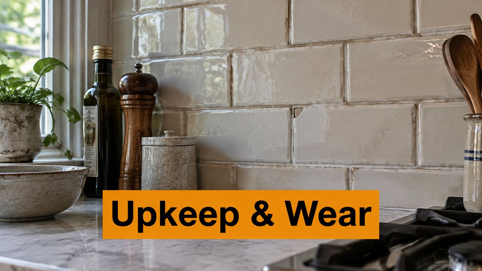
This splashback shows how a soft cream surface can provide interest beside an everyday cooking area.
What you take on
- More exposed grout: Wider joints give you more joint surface to maintain.
- Additional installation work: Sorting, dry-laying and checking the layout can require more labour than a uniform wall tile.
- Pattern-related cutting: Elaborate arrangements need a layout-specific allowance for offcuts and breakage.
- Less tolerance for rushed detailing: Unresolved corners or inconsistent alignment can look accidental rather than crafted.
- Visible marks on gloss: Reflections can reveal smears even when the wall is otherwise clean.
Build a routine around the location
For a kitchen, remove grease splashes before they become a sticky film. Use a soft cloth and the glaze-compatible neutral cleaner, then wipe away cleaner residue. Around a vanity, drying frequent splashes can be more useful than repeatedly applying stronger cleaning products.
Clean relief surfaces with a soft brush that reaches the low points. Don't use a metal scourer to force residue out of the profile. Test an unfamiliar cleaner on a spare tile or an inconspicuous area before using it across the wall.
Check grout and flexible joints during routine cleaning. Hairline cracks, missing sections or persistent discolouration deserve investigation rather than a cosmetic cover-up. Reseal grout only where the particular product requires it; not every grout system has the same maintenance needs.
Budget for the installed wall
The tile price is only one part of the decision. Ask for an installation quote that identifies substrate preparation, waterproofing where applicable, tile fixing, grout, movement joints and exposed-edge finishing.
Have your tiler calculate the additional tile from the proposed layout rather than applying an unexamined waste allowance. Herringbone, awkward window reveals and numerous external corners can all change how much usable material remains after cutting. Keep suitable spare tiles for later repairs.
Choose the finish you can comfortably maintain. If a gloss sample looks good only immediately after wiping, compare a matt alternative before buying. The right handmade look should suit your normal routine, not demand a new one.
Order Samples and Confirm Measurements Before You Buy
Don't place the full order from a screen image. You need to judge the colour against the room, the profile under its lighting and the variation across a group of tiles.
We're a Melbourne tile store, and our sample service lets you see and touch tiles before choosing them. Use those samples as a small specification exercise, not as colour swatches.
A buying checklist that prevents avoidable changes
- Compare finishes in the room. View your shortlisted samples in daylight and under the kitchen or bathroom lights, because a glaze that looks calm near a window may produce strong reflections under close task lighting.
- Build a representative sample board. Arrange the tiles with the intended spacers and, where possible, a grout sample, so you can judge the joint network and surface together.
- Have your tiler verify measurements. Tiles from different batches can differ slightly in colour and size, so we recommend a tiler's measurement check before you place an order.
- Order the job as a coordinated quantity. Aim to obtain the required tiles from the same batch, with an allowance calculated for the actual cuts, breakage risk and pattern, rather than planning to buy the remainder later.
- Confirm suitability before approving the purchase. Keep the product information for floors and shower applications with the job documents, so the tiler can check the intended use against the installation.
Ask the supplier to identify the batch on the order and explain what to check when the boxes arrive. Inspect the delivery before installation begins, and raise unexpected shade, size or damage issues before any affected tiles are fixed.
Know the ordering costs before committing
Ask about sample delivery to your Melbourne or Victorian address, whether samples are free or charged, and what the full-box delivery will cost. If you're buying through a builder or tiler, confirm who is placing the order and whether a trade account is available for that purchase.
Keep the approved sample board available during installation. It gives you and the tiler a shared reference for the intended mix, joint appearance and grout colour without relying on memory.
Order your samples this week, then book the tiler's measurement check before committing to the box quantity. That sequence gives you a chance to change the finish or layout while the decision is still inexpensive.
Tiles Mate Pty Ltd offers a Melbourne tile selection and sample service so you can compare the colour, finish and feel of handmade-look options before choosing. Visit Tiles Mate Pty Ltd to arrange samples, then take your preferred tile and joint layout to your tiler for a measurement and suitability check before ordering.